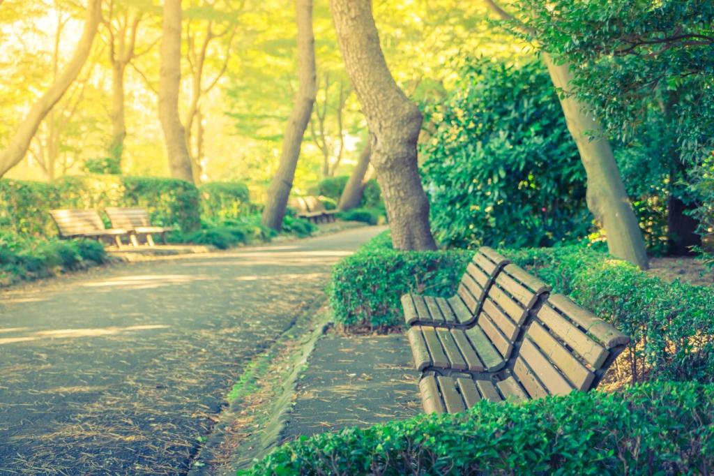
Designing Color Pathways for Mindful Movement
Arrange plants from cool to cooler—teal foliage to soft blue blooms—to create a visual tapering of energy. This gradient encourages gradual deceleration, like easing a dimmer switch. Test one short path and share how your stride and breath respond.
Designing Color Pathways for Mindful Movement
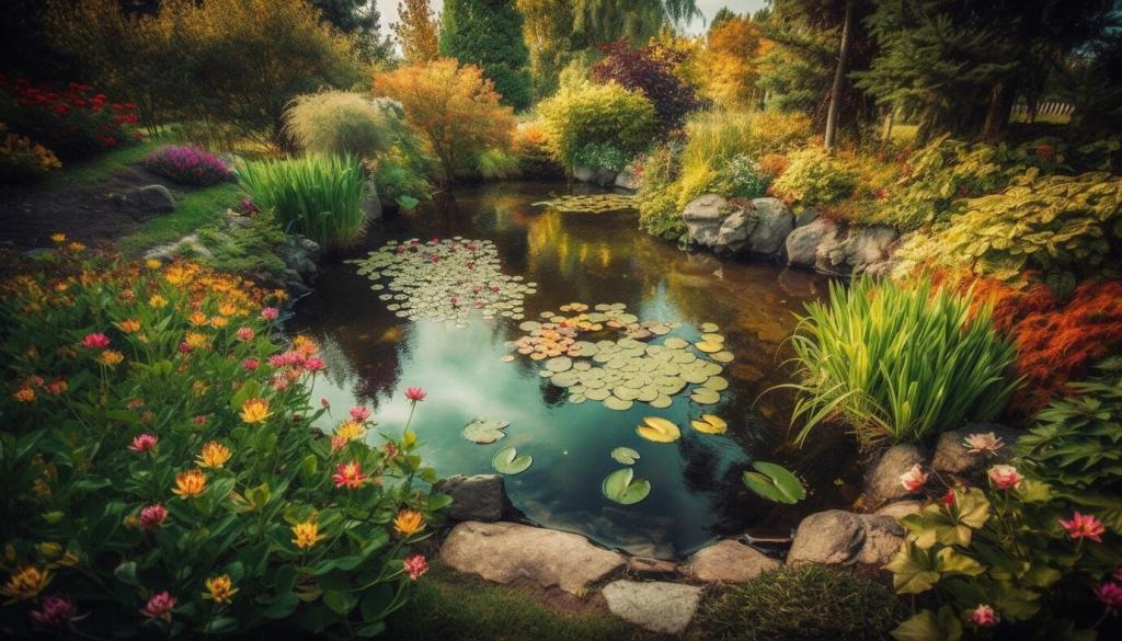
Use color to signal time’s passage without urgency: spring’s pale greens, summer’s muted blues, autumn’s smokey plums, winter’s silvery grasses. These understated shifts act as mindful bells, reminding you to return to presence as the garden gently changes.